
Writing Effective Alt Text
Alt text (alternative text) makes images accessible to students using screen readers, especially those who are blind or visually impaired. It also helps clarify the purpose of the image in your teaching.
Quick Guidelines
- Keep it short and meaningful.
- Describe the image’s purpose, not just its appearance.
- Skip “image of…”—screen readers already announce it.
- Mark purely decorative images as decorative.
Heading Structure Best Practices
Using proper heading styles improves accessibility and helps all students navigate your content more easily.
- Use built-in heading styles in Word, Google Docs, or PowerPoint—don’t just change font size or bold text.
- Follow a logical order:
- Heading 1: Document title or main section
- Heading 2: Major section
- Heading 3–6: Subsections (don’t skip levels)
- Keep headings clear and concise - they should summarize the section’s content.
- Customize styles (font, size, color) through the style settings—not manual formatting—to maintain accessibility.
- Limit to Heading 1–6 for compatibility with PDFs and web content.
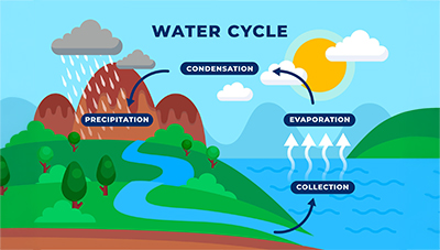
Image Use |
Good Alt Text |
|
Diagram of the water cycle |
“Water cycle: evaporation, condensation, precipitation, collection” |
|
Historical photo of Ada Lovelace |
“Ada Lovelace, 19th-century mathematician and computing pioneer” |
|
Bar chart of test scores |
“Bar chart showing Group A: 85, Group B: 78, Group C: 92” |
|
Decorative border |
Marked as decorative (no alt text needed) |